
Prototyping Web Flows: From Wireframe to Interactive
Build interactive prototypes in Figma that actually show how your website will work. Learn about interactions, animations, and testing your designs before development.
Read ArticleLearn how to create reusable components that save time and keep your design system consistent across all projects.

You’ve probably experienced this frustration — you update a button style in one place, but it’s different somewhere else. Components solve that problem. They’re basically reusable design blocks that automatically sync across your entire project. Once you create a component, any change you make updates everywhere it’s used.
The real power isn’t just consistency though. It’s speed. You’ll build faster, collaborate better, and maintain cleaner files. Plus, when clients ask for changes, you’re making one edit instead of fifty.
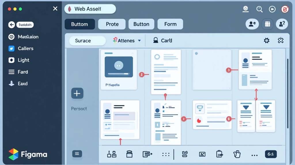
A component in Figma is a master design element that you can reuse throughout your projects. When you create a component, Figma creates a main version (the primary component) and allows you to create copies called instances. Any changes you make to the main component instantly update all instances — that’s the magic.
Think of it like a template system. You’re not manually duplicating elements; you’re creating smart, linked copies. This works perfectly for buttons, navigation bars, cards, form fields, and any element you’ll use multiple times. The more consistent your designs need to be, the more you’ll benefit from components.

Creating a component is straightforward. Start by designing your element — let’s say a primary button. Make it look exactly how you want it. Then select the element and either right-click and choose “Create component” or use the keyboard shortcut. That’s it. You’ve just created a main component.
Figma will place a diamond icon next to your component name, showing it’s the main version. Now you can drag instances of this button anywhere in your file. Need a secondary button style? You can create component variants — different versions of the same component with different properties. This keeps your library organized and makes updating related styles super efficient.
Without organization, your components become a mess. You’ll have fifty buttons and forget which one’s the main version. The solution? Use naming conventions and groups. Figma uses forward slashes in names to create hierarchies. A button named “Button/Primary/Large” creates a nested structure that’s easy to navigate.
Spend time upfront naming components logically. Group by type: Buttons, Forms, Cards, Navigation. Within each group, organize by variant: Primary, Secondary, Disabled. This system saves hours later when you’re searching for a specific component or updating your design system. Good naming also helps your entire team understand the component structure instantly.
Naming example: Button/Primary, Button/Primary/Hover, Button/Secondary, Button/Disabled
Don’t try to create the perfect component system on day one. Begin with your most-used elements — buttons, text styles, basic cards. Build from there as you understand your needs better.
Variants let you create different versions of one component without creating separate components. A button variant could be Primary, Secondary, or Disabled. This keeps your library lean and manageable.
Create a design system file that documents your components. Include usage guidelines, spacing rules, and color definitions. Your team will thank you when they’re building with these components.
Once you establish your component structure, stick with it. Don’t create duplicate components for the same thing. This discipline keeps your file manageable and your designs unified.
When you update a component, let your team know. Big changes to core elements affect everyone. A quick message prevents confusion and ensures everyone’s working with the latest version.
Every few months, review your component library. Delete unused components, rename confusing ones, and consolidate where possible. This keeps your system lean and your file performance solid.
Once you’re comfortable with basic components, Figma offers more advanced features. Component sets let you group related components together. Main components and instances give you powerful flexibility. You can even use component properties to control text, colors, and visibility without creating separate variants for every possibility.
Consider exploring shared libraries too. If you’re working with a team, publish your components to a team library. Everyone can access the same components, and updates sync across all files. This scales your component system from one project to your entire organization. It’s a game-changer for teams building multiple products.
“Components aren’t just about saving time — they’re about creating a shared language across your design team. When everyone’s using the same building blocks, consistency becomes automatic.”
Components in Figma transform how you design. You’re not just creating static mockups anymore — you’re building smart, reusable systems that grow with your projects. The time you invest setting up components now pays dividends every time you need to make updates or start a new design.
Begin with one simple element today. Create a button component. Use it in a few places. Then update it and watch the magic happen. Once you experience that efficiency, you’ll understand why components are essential for professional design work. Your future self will be grateful for the organized, maintainable design system you’re building right now.
This guide provides educational information about using Figma components. Design practices and Figma features evolve regularly, so we recommend checking Figma’s official documentation for the latest updates and advanced features. Your specific project needs may require different approaches — adjust these recommendations based on your team’s workflow and project requirements.