Prototyping Web Flows: From Wireframe to Interactive
Build interactive prototypes in Figma that actually show how your website will work. We’ll cover interactions, animations, and user testing.
Why Prototyping Matters in Web Design
There’s a massive gap between a static wireframe and what users actually experience. A prototype bridges that gap. It’s where your design decisions either make sense or fall apart. You’ll see right away if a flow feels confusing, if buttons are too small, or if the interaction doesn’t work the way you imagined it.
When you can show a client or stakeholder something interactive—something they can actually click through—conversations change completely. Suddenly they’re not imagining what you’re describing. They’re experiencing it. And you get real feedback instead of vague opinions about colors and spacing.


Starting from a Solid Wireframe
Your prototype is only as good as your foundation. Before you jump into Figma interactions, you need a clear wireframe that shows structure and content hierarchy. This isn’t about visual design yet—it’s about function. Where’s the navigation? How does the user flow through the page? What happens after they click that button?
Most people rush this step. They’ll sketch something on a napkin and jump straight to high-fidelity mockups. But spend two hours on a proper wireframe—showing all the key sections, labeled clearly, with annotations about behavior—and you’ll save yourself days of redesign work later.
- Define user paths and decision points
- Show content hierarchy clearly
- Annotate interactive elements
- Keep it low-fidelity (boxes and text only)
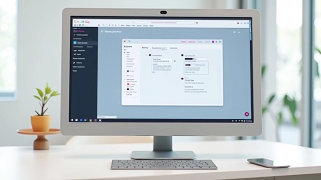
Adding Interactions and Animations
This is where the magic happens. In Figma, you’re not just moving elements around—you’re creating actual user interactions. Hover effects, page transitions, modal pop-ups, form validations. When you click a button, something happens. And that something teaches you whether your design actually works.
Start simple. Don’t add animations to everything. A subtle 300ms fade-in when a modal appears feels right. A button that scales down 2% on hover feels responsive. But a spinning, bouncing, glowing animation on every interaction? That’s exhausting. Restraint wins.
Pro tip: Test your animations at 1x speed, not in slow-mo. That’s how users will experience them. 300ms feels snappy. 500ms feels sluggish. The difference is huge.
Mapping Complete User Flows
A real prototype shows every step of the user journey, from entry point to completion.
Landing Page
User arrives and needs to understand what you offer. One clear CTA. No confusion.
Product/Service Page
Details, benefits, and social proof. Interactive elements show features in action.
Call-to-Action
User takes the next step. Form submission, sign-up, or checkout flow.
Confirmation
Success message, next steps, or welcome screen. User knows they’re done.

Testing Your Prototype
Don’t wait until you’ve coded everything to test. Share your Figma prototype with real users—or at least people who aren’t involved in the project. Watch where they hesitate. Listen to what confuses them. You’ll catch problems in hours that would’ve taken weeks to fix in code.
The prototype doesn’t need to be perfect. It just needs to be testable. Can they click through the main flow? Do they understand what each page is for? Does the interaction feel natural? These are the questions that matter.
“A prototype is worth a thousand meetings. You can show, not tell. And users will tell you exactly what works and what doesn’t.”
— Design Team Lead, Southeast Asia
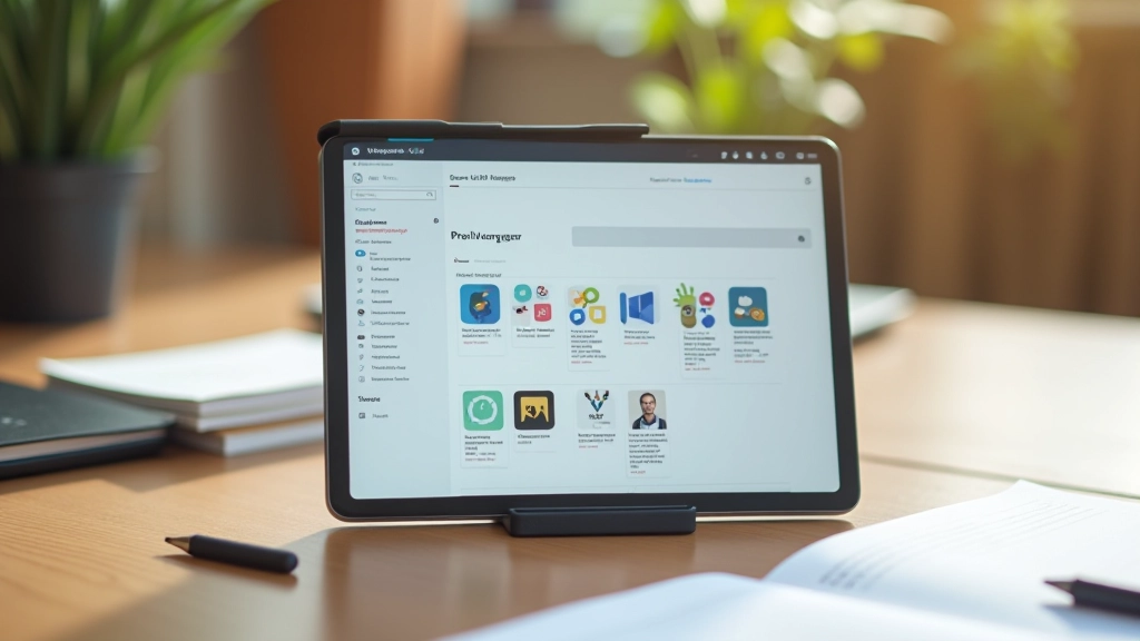
Essential Figma Features for Prototyping
These are the tools you’ll actually use to build interactive prototypes.
Interactions
Define what happens when users click, hover, or drag. Link screens together, trigger animations, show/hide elements based on user action.
Animations
Make transitions feel natural. Fade-in, slide, scale, or rotate elements as users navigate. Keep timing subtle—usually 200-500ms.
Component States
Show different states of buttons, forms, and UI elements. Hover, active, disabled, loading. Makes interactions feel complete.
Prototype Sharing
Generate a shareable link. Users test without Figma access. Collect feedback right in the prototype comments.
Practical Tips That Actually Work
Start with the happy path first—the ideal scenario where everything works smoothly. Build that flow completely before adding error states or edge cases. This keeps you focused and prevents getting lost in complexity.
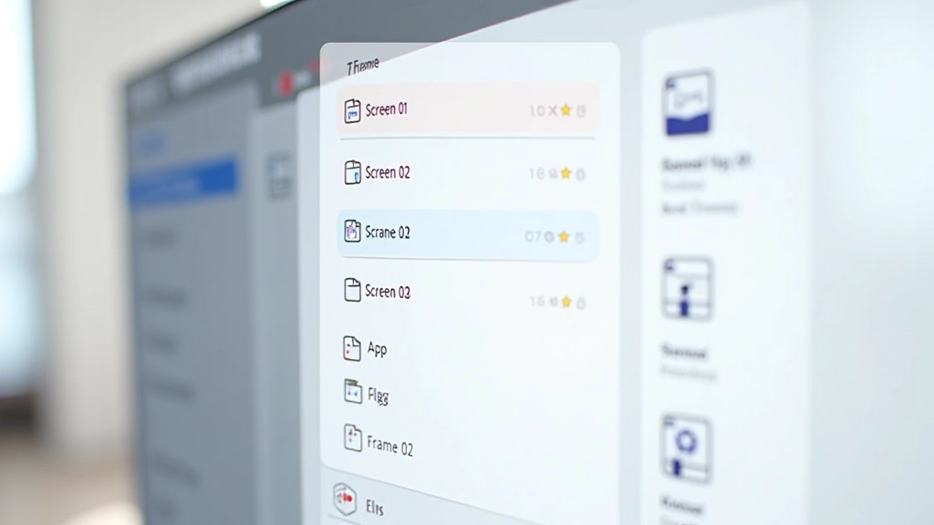
Use naming conventions that make sense. Call your frames “Screen 01 – Landing”, not “Frame 47”. When you’re testing with a user, you want to know exactly where they are. Confusing names mean confusing testing sessions.
Keep prototype files organized with clear naming and logical frame arrangements
Test on actual devices—mobile prototypes feel different on a phone vs. a laptop
Share early, iterate fast—perfectionism kills progress
Document your interactions—future you will forget why you did things a certain way
From Wireframe to Interactive Reality
Building a prototype in Figma transforms your design from static mockups into something users can actually experience. You’ll see what works, what doesn’t, and where to improve—all before you write a single line of code.
The best part? It’s fast. You can prototype a complete user flow in a day or two. Compare that to coding it, finding issues, and rebuilding. Prototyping saves time, reduces mistakes, and gets you better feedback from stakeholders and users.
Ready to Build Interactive Prototypes?
Start with a wireframe. Add interactions. Share with users. Iterate. That’s the flow that works.
Explore More GuidesDisclaimer
This guide provides educational information about prototyping techniques and Figma features. The specific tools, features, and methods described are current as of February 2026. Figma’s interface and capabilities may change. Always refer to the official Figma documentation for the most up-to-date information. Every project is unique—apply these principles thoughtfully to your own design challenges.
Continue Learning